
プログラミングで投資の分析ができる?
機械学習で為替を予想できる?
コードはどうしたらいいの?
という悩みを解決できる記事になっています。
なぜなら、私はプログラミング言語Pythonで
投資の分析をしているからです。
結論だけ言うと、
FXのレートを予測するのは可能です。
この記事では機械学習でFXのレートを予測する方法を紹介します。
読み終えていただければ、
機械学習でFXのレートを予測できるようになります。
※おすすめの勉強本
プログラミングで投資の分析をするなら必読の一冊!
実例やチャート付きでPythonを学べます。
Pythonのインストール方法から学べるので
これから始める人にもおすすめです。

機械学習でFXを予想して大勝したい

前の記事ではPythonの機械学習を使って
株式や仮想通貨の価格予想をしました。

これをFXに活用すれば、稼げるのではないかと
考えたのが始まりです。
別の記事ではFXのデータを取得する方法を紹介しました。

今回はいよいよ機械学習でFXのレートを予測します。
通貨ペアはEURUSD、時間足は15分足にしました。
データ数は993個です。
終値で機械学習を行いますが、小数点以下の桁数が多いと
計算に支障が出るので、整数に直しています。
データの8割を学習に使用して、
残り2割は予測しながら、実際のレートと比較しました。
コードはこちらです。
'''
データの取得
'''
#ライブラリのインポート
import csv
import requests
import json
import pandas as pd

# replace the "demo" apikey below with your own key from https://www.alphavantage.co/support/#api-key
url = 'https://www.alphavantage.co/query?function=FX_INTRADAY&from_symbol=EUR&to_symbol=USD&interval=15min&outputsize=full&apikey=YOURAPIKEY'
r = requests.get(url)
data = json.loads(r.text)

data = data['Time Series FX (15min)']

fx_data = []

for i,df in enumerate(data):
    column = []
    fx = data
    column.append(df) #日時
    column.append(float(fx[df]['1. open']))#始値
    column.append(float(fx[df]['2. high'])) #高値
    column.append(float(fx[df]['3. low'])) #安値
    column.append(float(fx[df]['4. close']) * 100000) #終値
    fx_data.append(column)

fx_df = pd.DataFrame(fx_data)
fx_df = fx_df.set_axis(['Datetime', 'open', 'high', 'low', 'close'], axis=1)

'''
ここから機械学習
'''
#必要なライブラリのインポート
import math
import pandas_datareader as web
import numpy as np
import pandas as pd
from sklearn.preprocessing import MinMaxScaler
from keras.models import Sequential
from keras.layers import Dense, LSTM
import matplotlib.pyplot as plt
import datetime
plt.style.use('fivethirtyeight')

#終値をグラフ化する
plt.figure(figsize=(16,8))
plt.title('Close Price History')
plt.plot(fx_df['close'])
plt.xlabel('Date',fontsize=18)
plt.ylabel('Close Price USD ($)',fontsize=18)
plt.show()
plt.savefig('closehistory.png')

#dfから終値だけのデータフレームを作成する。(インデックスは残っている)
rdata = fx_df.filter(['close'])
#dataをデータフレームから配列に変換する。
dataset = rdata.values

#トレーニングデータを格納するための変数を作る。
#データの80%をトレーニングデータとして使用する。
#math.ceil()は小数点以下の切り上げ
training_data_len = math.ceil(len(dataset) * .8)

#データセットを0から1までの値にスケーリングする。
scaler = MinMaxScaler(feature_range=(0, 1))
#fitは変換式を計算する
#transform は fit の結果を使って、実際にデータを変換する
scaled_data = scaler.fit_transform(dataset)

train_data = scaled_data[0:training_data_len, :]

#データをx_trainとy_trainのセットに分ける
x_train = []
y_train = []
for i in range(60, len(train_data)):
    x_train.append(train_data[i-60:i, 0])
    y_train.append(train_data[i, 0])

x_train, y_train = np.array(x_train), np.array(y_train)

#LSTMに受け入れられる形にデータをつくりかえます
x_train = np.reshape(x_train, (x_train.shape[0], x_train.shape[1], 1))

#LSTMモデルを構築して、50ニューロンの2つのLSTMレイヤーと2つの高密度レイヤーを作成します。(1つは25ニューロン、もう1つは1ニューロン)
#Build the LSTM network model
model = Sequential()
model.add(LSTM(units=50, return_sequences=True,input_shape=(x_train.shape[1],1)))
model.add(LSTM(units=50, return_sequences=False))
model.add(Dense(units=25))
model.add(Dense(units=1))

#平均二乗誤差(MSE)損失関数とadamオプティマイザーを使用してモデルをコンパイルします。
model.compile(optimizer='adam', loss='mean_squared_error')

#Train the model
model.fit(x_train, y_train, batch_size=1, epochs=1)

#Test data set
test_data = scaled_data[training_data_len - 60: , : ]

#Create the x_test and y_test data sets
x_test = [] #予測値をつくるために使用するデータを入れる
y_test =  dataset[training_data_len : , : ] #実際の終値データ

for i in range(60,len(test_data)):
    x_test.append(test_data[i-60:i,0]) #正規化されたデータ

#Convert x_test to a numpy array
x_test = np.array(x_test)

#Reshape the data into the shape accepted by the LSTM
x_test = np.reshape(x_test, (x_test.shape[0], x_test.shape[1], 1))

#Now get the predicted values from the model using the test data.
#Getting the models predicted price values
predictions = model.predict(x_test)
predictions = scaler.inverse_transform(predictions) #Undo scaling

#Calculate/Get the value of RMSE
rmse = np.sqrt(np.mean(predictions - y_test) ** 2)
rmse

#Let’s plot and visualize the data.
#Plot/Create the data for the graph
train = rdata[:training_data_len]
valid = rdata[training_data_len:]
valid['Predictions'] = predictions#Visualize the data

plt.figure(figsize=(16,8))
plt.title('Model')
plt.xlabel('Date', fontsize=18)
plt.ylabel('Close Price USD ($)', fontsize=18)
plt.plot(train['close'])
plt.plot(valid[['close', 'Predictions']])
plt.legend(['Train', 'Val', 'Predictions'], loc='lower left')
plt.show()
plt.savefig('model.png')
出来上がったグラフがこちら
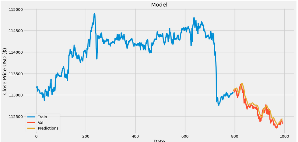
青色が学習期間における実際のレート
黄色が機械学習での予測レート
橙色が実際のレートです。
解離は見られるものの、
まあまあな精度で予測できたのではないでしょうか?
次回は次のレートを予測する方法を紹介します。
※おすすめの勉強本
プログラミングで投資の分析をするなら必読の一冊!
実例やチャート付きでPythonを学べます。
Pythonのインストール方法から学べるので
これから始める人にもおすすめです。
ここまで読んでくださりありがとうございました。^^